
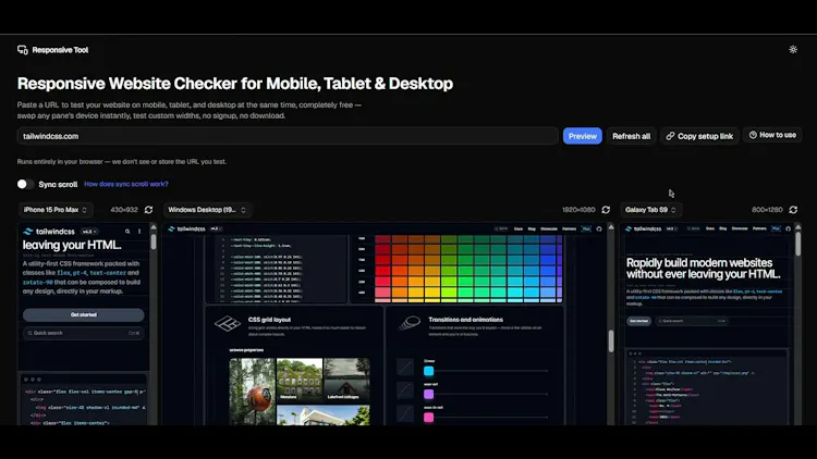
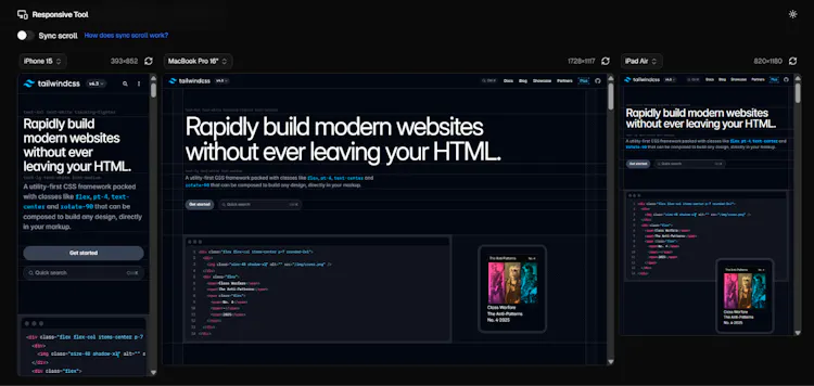
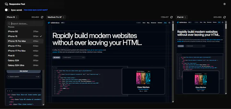
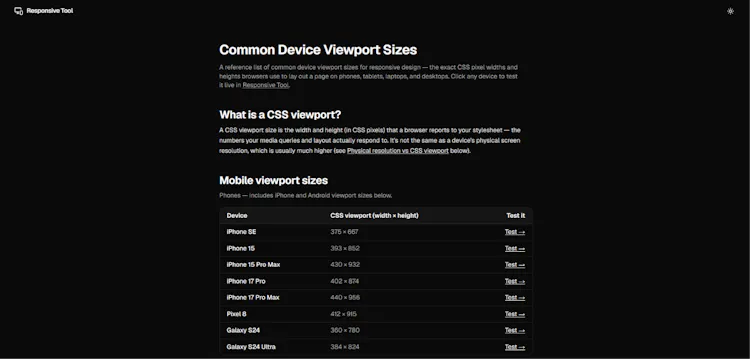
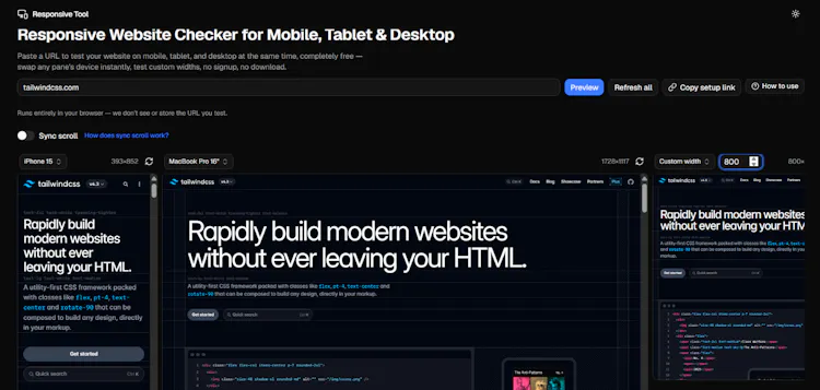
Responsive Tool shows your site on mobile, tablet, and desktop at once — free, no signup, no download. Paste any URL, see it across real device viewports side by side. Swap any pane's device, enter custom widths, refresh one viewport after a code change, or share your setup via URL. Built with Next.js 16, React 19, Tailwind v4, on Cloudflare Workers. Includes reference pages for device viewport sizes and CSS breakpoints.
Comments, support and feedback
About this launch
Responsive Tool by Mohammed Faizan Ahmed Will be launched June 12th 2029.